Webopac Preferences – Technical Tips
1. Introduction
In this section various options are described that are related to the WebOPAC but are not set using the WebOpac Preferences Tool.
2. Colours and fonts
Infor recommend you consult the official W3C website http://www.w3org to see what the recommended standards are for Cascading Style Sheets.
Infor also recommend that you use a colour scheme that can be recognised and reproduced by the major browsers. Examples of these can be found by searching for “Websafe colour” on the Internet.
The stylesheet that is applied is determined in the Web Opac Preferences, Profile – Options. Note that two stylesheets are currently defined, for Internet Explorer and Netscape.
2.1 Menu buttons
The menu buttons are displayed as cells in a table. This means that the appearance of each “cell” can be configured using Style Classes, which are configured in the stylesheet.
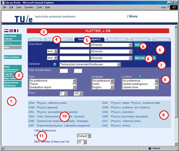
To determine which menu buttons appear on the left side of the Web Opac go to Profile – Menus in the Web Preferences.
Available buttons are displayed for:
- Main screen
- Lists (Brief display)
- Full description
- History
- Savelist
- Search trees
- User activities
- SDI Profiles
- SDI Query
· Select which menu buttons you want to appear for each page, and in what order.
· Enter the text that you want to appear on the button.
· Select the Style Class you want to apply to the button.
· Search for the Web Opac directory (eg. C:\vwdir)
· Open the stylesheet. For Internet Explorer vubisie.css with Notepad.
2.1.1 Classes of buttons
The default classes of buttons are:
- buttontekst
- buttontekst2
- listbuttons
- fullbbbuttons
- buttontekstnoactive
The default styles for each button are (with examples):
- the background colour
- font family (arial)
- font size (8)
- font weight (bold, lighter)
- alignment (left, center, right) and vertical alignment.
- text decoration (underline, overline, line-through, blink)
You can add other definitions, such as Font style (italic, oblique) or Font variant (small-caps).
Within each class you can further define how each button appears in different circumstances. The different ways to display a button might be:
- link
- visited
- hover
For each further definition you add a sub-definition such as button A: in which you define only what will be different. This might be the background colour for visited buttons, or text colour for hover.
Example:
.buttontekst { color:#99BBBB;
background-color: #006673;
font-family: arial;
font-size: 8pt;
font-weight: bold;
text-align: center;
text-decoration: none;
.buttontekst A:link { color: white; text-decoration: none
; width : 100%; height : 100% }
.buttontekst A:visited { color: white; text-decoration: none ; width : 100%; height : 100% }
.buttontekst A:hover { color: yellow; text-decoration: none ; width : 100%; height : 100% }
You can define the buttons using images instead of the style class. In this case, insert the url to the image in the Preferences, Profile – Menus. Note that you will not be able to create the visited, and hover effects, if you do this.
You can define the other parts of the Web Opac, like the Title bars and List headers, in the same way.
2.2 Logo's
Note that the logos that appear at the top of the first page are defined in Preferences, Profile – Texts. An example of the default logos display is shown below:
<table align="center" border="0" cellpadding="2" cellspacing="4" width="100%">
<tr>
<td class=header>
<IMG SRC="images/vubissmart.gif"ALT="VubisWeb" width="120" hspace="40" height="60">
</td>
<td width=1 bgcolor="#ECF8FF"></td>
<td class=headertitle>
<IMG SRC="images/Infor_Robert.gif"ALT="geac logo" hspace="40" vspace="20" height="60">
</td>
</tr>
</table>
To display the logos on the background colour, define the background for the logo bgcolor to be the same as for the colour defined in the stylesheet.
The text that displays at the bottom of the page is defined in Preferences, Profile – Texts.
To display at the right hand side, as in the default screen, define the table with two columns of 60% and 40% and put the text in the smaller of the two columns, as shown below:
<Table>
<tr>
<td width=60%><br></td>
<td width=40%>
<address>
<font size="2">
<b>My local Library</b><br>
Infor Software Solutions,<br>
2 Westpoint Row, Bristol BS32 4QG<br>
tel.: 01454 892200, fax.: 01454 892246
</font>
</address>
<p>
<font size="2">
For further information you can contact the
<a href="mailto:helpdesk@libr.tue.nl">helpdesk</a>
of the library. <br>
Please mention your mail and email address.
</font>
</p>
</td>
</tr>
</Table>
2.3 Style classes
A brief explanation of style classes as they appear on the various screens of the WebOpac.
2.3.1 General
1.
body
If the background colour changes, the images to make the corners of the tabs rounded may need to be changed. Those images are ‘hoekr.gif' and ‘hoekl.gif'. There are many more images in the Vubis Smart set. See the csp page Corners.csp. The image for e.g. background color ‘ddffee' is delivered in the Vubis set as ‘hoekr_ddffee.gif' etc.
2.
Class is configurable via the Preferences, Profile - Menus
The link has the class ‘button' which is only used to make the full width of the button clickable, not just the text area.
Mind that it is possible to use your own images and not the default button type. Just enter the url for the image and leave the style class empty if you want no style class.
3. usertitlebar
4. tabnoactive
5. tabactive
6. Class is configurable via the Preferences, Profile - Search methods
7. tabDatabase
8. tabRestrictions
9. TreeTable
10. TreeElement
11. StartElements
Note
The next not only have a style but also an id “tabitem”. This is used in the default stylesheet to denote left alignment of the text as well as font size.
2.3.2 Result lists
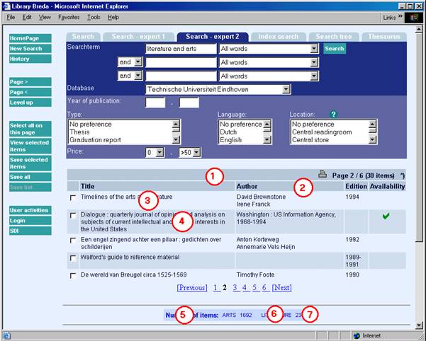
Classes mentioned for the start page are not repeated on this page.
1. listheadpages
2. listhead
3. listitemOdd
4. listitemEven
5. SearchPartHeader
6. SearchPartText
7. SearchPartCounter
8.
titlebar
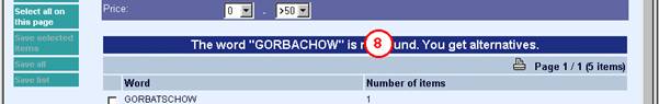
This class is used for all types of messages etc. on the list screen.
2.3.3 Full description
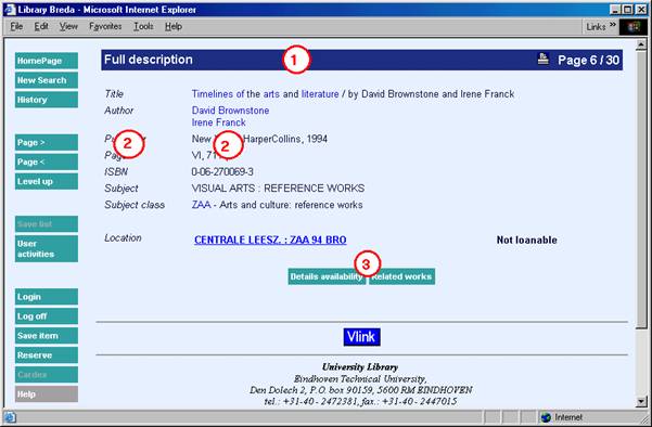
Classes mentioned for the start page are not repeated on this page.
1. titlebar
2. Classes are configurable (general or per element) via the Preferences, All profiles - Templates
3. Classes are configurable (general or per element) via the Preferences, Profile - Texts
2.3.4 History

Classes mentioned for the start page are not repeated on this page.
1. titlebar
2. listhead
3. listitemOdd
4. listitemEven
5. buttontekst
2.3.5 Login


Classes mentioned for the start page are not repeated on this page.
1.
descrname
An error message on this place has the style class message
2. descrname
3. buttontekst
4. descrname
2.3.6 User activities

Classes mentioned for the start page are not repeated on this page.
1. titlebar
2. menuheader
3. menutekst
3. CSP Pages
CSP (Caché Server Pages) is the Caché concept of making web pages that communicate with a Caché database.
A CSP page can contain HTML and javascript code to present data etc. just like normal HTML pages. Furthermore a CSP page can contain Caché Object Code and special CSP tags to communicate with the Caché database. The CSP page is stored at the Caché server, unlike HTML pages which are stored on the Web server. The pages are compiled and stored as a %CSPPage object class and as binary code in a Caché database.
In most VubisWeb CSP pages, frames are used. In the left frame is a menu where buttons for navigation are grouped. In the right frame (the 'body') the information is displayed.
3.1. CSP Page for Shelfmarks
You can define a web page, showing where a book can be found in the library. The web page can be a static HTML page or a CSP page. If you define a CSP page, you can define within that page a variable text and a variable image. The web page, text and image can all be defined on this page.
In the Web Preferences - All Profiles – Shelfmarks:
First choose an interface language (web page, text and image can all be different for different languages) and a database. If you have defined elements for this database, you see a listing. You can also define a new element. Choose an Institution/location, choose a type and fill in the beginning of the shelfmarks for which this definition is valid. E.g. if the definition is valid for all books with a shelfmark, starting with '20', you fill in 20 here. You can also define a range. In that case use the second input box. If you want the element only be used for specific workstations (e.g. to define a map with an arrow 'you-are-here-now') you can fill in the IP address of that workstation here. Existing element can be deleted or modified.If you want to make a csp page with a variable text and / or image:
(1) Make a static HTML page, but rename the extension of the page after you finished the design from '.html' to '.csp'.
(2)
Insert the following code somewhere between the <head> and </head> tags:
<SCRIPT Language="Cache" RUNAT=server>
Set Text=%request.Get("Text")
Set Image=%request.Get("Image")
</script>
(3) In the CSP file, on the place where you want the text to appear, insert the code:
#(Text)#
(4) In the CSP file, on the place where you want the image to appear, insert the code:
#(Image)#
(5) Save the file in a directory 'UserFiles' as a subdirectory of the directory on the Cache server where the CSP files are stored.
(6) Save the image in a directory 'UserFiles'. This must be a subdirectory of the directory on the Web server where the style sheet files are stored.
4. Connect to Vubis from outside
In the set of CSP pages of Vubis Smart are two pages that can be used to connect to Vubis from outside the WebOpac. Those pages and their use are described below.
4.1. LinkToVubis.csp
The web page LinkToVubis.csp is meant to link from outside Vubis (e.g. with an url from the library homepage or from a HTML booklist) to a full record display or list.
Examples:
·
Link to a book with a known title, e.g. “WordPerfect”:
http://OurLib/LinkToVubis.csp?title=wordperfect&Database=2&Language=eng&
Profile=Central&NumberToRetrieve=10
·
Link to a book with a known ISBN:
http://OurLib/LinkToVubis.csp?isbn=9781565923928&Database=2&Language=eng
·
Link to a journal with a known ISSN:
http://OurLib/LinkToVubis.csp?isbn=0028-0836&Database=2&Profile=Swets
·
Link to a record with a known record number:
http://OurLib/LinkToVubis.csp?DataBib=6:233485&Language=fre
·
Link to a save list:
http://OurLib/LinkToVubis.csp?SaveListInfo=General_*_SELECTION&
NumberToRetrieve=20
The necessary / possible parameters are:
·
Profile. The WebOpac profile that has to be used while displaying the WebOpac page
If no profile is defined in the url, the “Default” profile is used.
·
Language. The language to be used in the WebOpac.
If no language is defined in the url, the default language for the defined or Default profile is used.
· NumberToRetrieve. The number of items to be shown in a list. If no number is in the url, a default of 10 is used.
· Database. The Database parameter contains the number of the database. This is used in combination with the title or isbn or issn parameters, described below.
·
Db. The Db parameter is an alternative way to define the database. Here the number must be preceded by three colons, so e.g. “:::2”. The database part of the Db parameter is the only one used in LinkToVubis at this moment.
The database number in Db is, just like the Database parameter, used in combination with the title or isbn or issn parameters, described below.
·
title. The title parameter contains the (first part of the) title.
With the title, a search is started in one of the indexes of the database, defined in Db or Database.
The index that has to be used must be defined in ^SysParVLink("Indexes","Title",Database) in the namespace AppParameters. Note that the parameter must be in all lowercase, the entry in ^SysParVlink with an initial capital.
The search method used for the search action is a browse method if available for the used profile. If no browse method is defined for that profile, the default search method is used.
The title is always right truncated, so if the last character is not an asterisk, it is added.
The case of the title (upper lower or mixed) is of influence on the result.
·
isbn. The ISBN of the book to be found in the database, defined in Db or Database. The used index must be defined in ^SysParVLink("Indexes","Isbn",Database). Note that the parameter must be in all lowercase, the entry in ^SysParVlink with an initial capital.
The parameter isbn is only used if there is no title parameter defined in the url.
·
issn. The ISSN of the journal to be found in the database, defined in Db or
Database. The used index must be defined in ^SysParVLink("Indexes","Issn",Database). Note that the parameter must be in all lowercase, the entry in ^SysParVlink with an initial capital.
The parameter issn is only used if there is no isbn or title parameter defined in the url.
·
DataBib. This parameter is used to link directly to the full description of a record if the database and record number are known. This parameter is formatted as: DatabaseId:RecordId.
·
SaveListInfo. This parameter is used to link to a save list. The parameter consists of three parts, separated by underscores. Those three parameters are the first, second and third subscript in the ^SaveList global. So e.g. for the save list:
^SaveList("General","*","SELECTION"), the parameter SaveListInfo would be:
”General_*_SELECTION”
4.2. ConnectToVubis.CSP
The page ConnectToVubis.CSP can be used to go to the WebOpac with AFO 500. If users are going from AFO 500 directly to Vubis.csp while they have a browser open with a page that they wanted to keep (e.g. a page with information on a book they describe), the WebOpac will be opend in that window. Calling ConnectToVubis ensures that, if a browser was open already, a new browser window will be opened.
All parameters that normally would be added to Vubis.csp can be added to ConnectToVubis.csp and will be passed to Vubis.csp.
Example:
^AFO("VubisSmart","WebOpac")=
“http://www.library.com/webopac/ConnectToVubis.CSP?Profile=Librarian”